How to Group a Report by Multiple Fields in Access 2016
You can group a report on multiple fields quite easily when using the Report Wizard in Access 2016.
A grouped report (also known as a summary report), is a report where one or more fields are used to group the other fields.
Access enables you to create reports that are grouped on more than one field. For example, you could group a sales report by state, then city.
Below is another example where we create a report that is grouped on two fields.
-
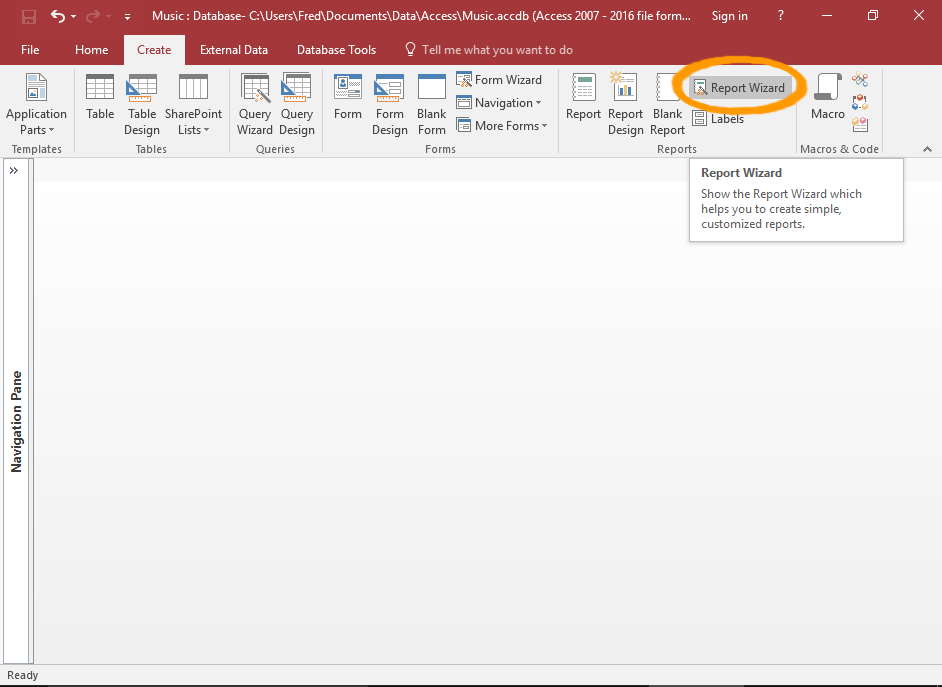
Launch the Report Wizard
Click Report Wizard on the Ribbon (from the Create tab).
-
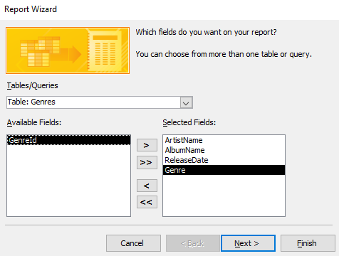
Select the Fields
Select the fields that you'd like to appear on the report. You can select fields from more than one table or query.
To do this, select a table or query using the drop-down list.
Then double-click a field in the left pane to move it across to the right pane. Repeat this for each field that is to appear in the report. The fields in the right pane will appear in the report.
Repeat for each relevant table/query.
Once done, click Next >.
You can also select a field, then use the
> button to move it across to the other pane.You can use the
>> button to move all fields across. -
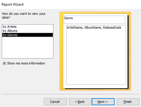
Choose a Grouping Table/Field
In the left pane, select the table or query that contains the field that the report needs to be grouped by.
This will be the first level grouping that all other fields are grouped under.
The right pane will show a preview based on your selection.
Click Next >.
The preview will only group the report if it finds a suitable field to group on. Otherwise, it will display the fields ungrouped.
If the preview doesn't display any grouping here, then your report will not be grouped. In this case, you'll need to go back and add a suitable field for grouping the report.
Alternatively, you can modify the report later and choose the grouping field at that time.
-
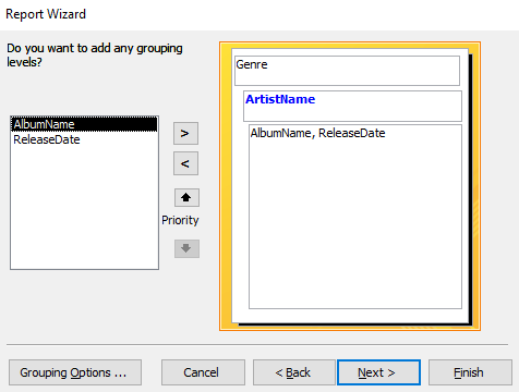
Add the Extra Field/s
Here's where you get to select the second field to be grouped on.
This field, if selected, is inserted between the first level grouping and the other fields.
Click Next >.
-
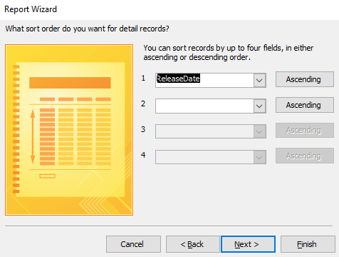
Specify the Sort Order if Required
You can specify fields to sort the report details by. This sorts the fields within each group (not the grouped fields).
Once done, click Next >.
-
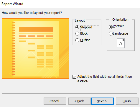
Choose a Layout
Select one of the preset layouts for the report.
The preview will update when you select an item. Feel free to select each one to see how it affects the layout.
You can also change the orientation to Landscape if required.
For our example, we'll leave the report with a Stepped layout and a Portrait orientation.
Once done, click Next >.
-
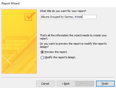
Name the Report
Enter a name for the report.
You also have the option of either previewing the report or modifying it's design once the wizard has finished creating it.
For our example, we'll leave it at Preview the report.
Click Finish to generate the report.
-
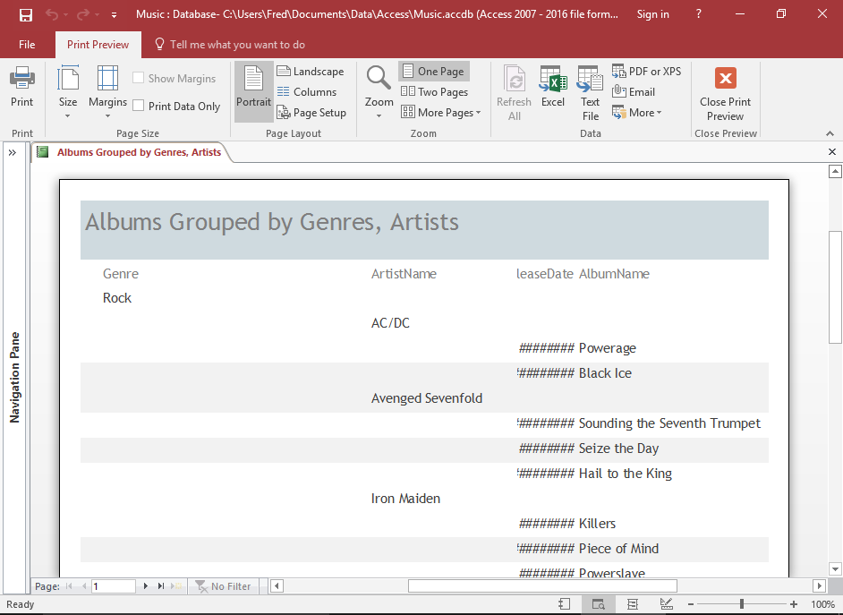
The Report
The report is now created. It is has two levels of grouping, as specified.
Reformatting the Report
You may need to reformat the report a little, to make it look more presentable.
In our example, we'll need to expand the width of the date field, rearrange the fields a little, and adjust the alternating background colors.
-
Formatting Changes in Layout View
You can switch between Layout View and Design View depending on which you find easier.
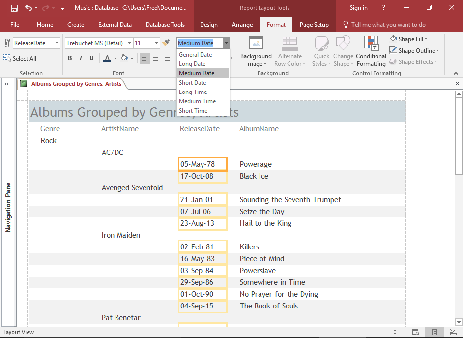
In this example, we're using Layout View to change the format of the date. Layout View makes this kind of thing easier to check, because it displays real data in the fields.
-
Review the Alternating Colors
Be sure to pay attention to how the alternate colors are rendered (i.e. the ones that Access automatically applies to reports).
The alternating colors on a grouped report can reduce the clarity of the grouped field. You might find that the grouped field shares its alternating color with either the preceding field, or the subsequent field. This ends up reducing that "grouped" look, and could possibly confuse the reader as to which fields are actually grouped.
This becomes even more of an issue as you add more grouped fields.
-
Remove the Alternating Colors
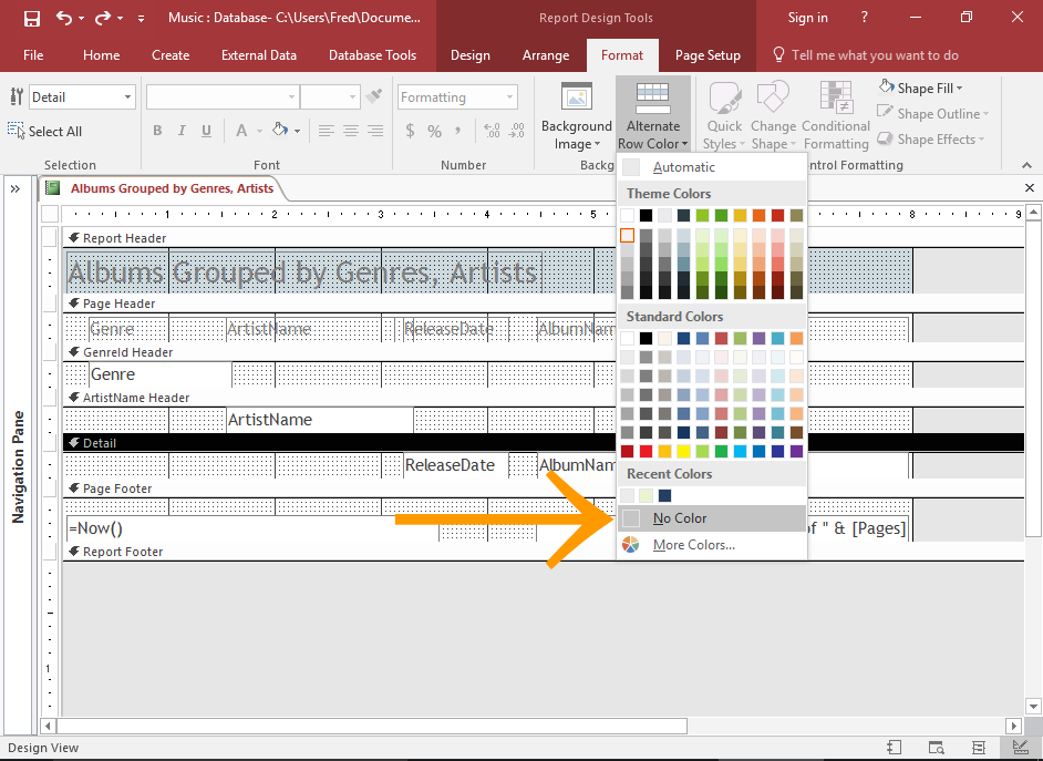
To remove the alternating colors, select the report Detail section in Design View.
Then click Alternate Row Color from the Format tab on the Ribbon, and select No Color from the contextual menu.
You can do the same thing for the grouped fields. To select the grouped field, select FieldName Header where FieldName is the name of the grouped field.
You'll need to do this for each grouped field if you want to remove all alternating backgrounds.
-
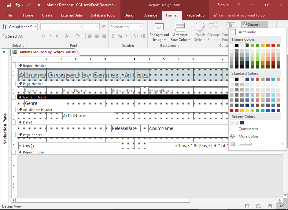
Format the Top Header Field
Now that we've removed the alternating background colors, it wouldn't hurt to add a background color to the top level header. This will distinguish it from the second level header and other fields.
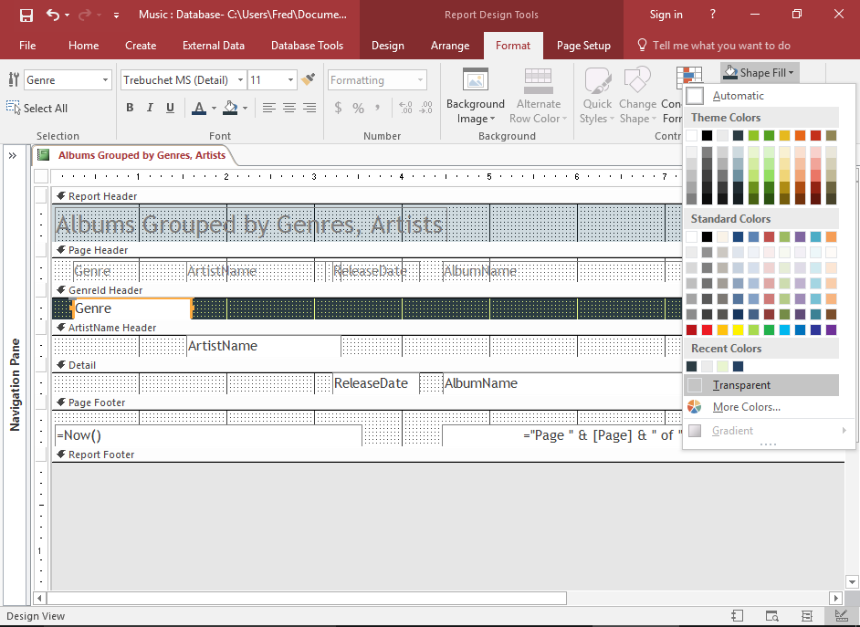
To do this, select FieldName Header where FieldName is the name of the grouped field, then click Shape Fill on the Ribbon (from the Format tab) and choose a color.
You may also need to set actual field itself to transparent if its color is a different color to the background.
You can also use a bold typeface for the grouped field by selecting the field, then clicking the Bold icon in the Ribbon.
The formatting applied here is just a suggestion. There are many other ways to format a report. Go ahead and experiment.
-
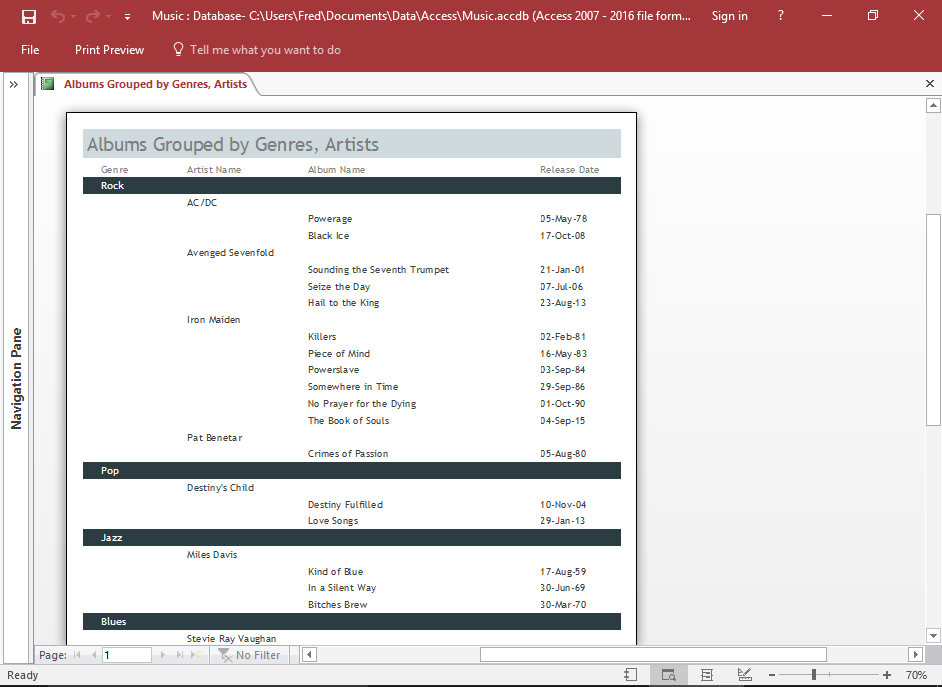
The Finished Report
Now, viewing the report in Print Preview (or another view) will display the report without the alternating colors.
In our example, the grouped field is also rendered in a bold typeface (after we bolded it using the Bold command in the Ribbon).