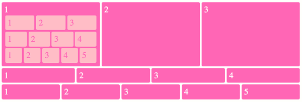
Flexbox Grid Examples
These flexbox grids can be used as a basis for a website layout or other purpose.
-
Random grid example
Just a basic example to demonstrate what can be done quickly with flexbox. Could be used as a starting point to a more advanced layout.
Uses the
nth-child()selector to explicitly set sizes on some of the flex items, but this can be changed to classes if required.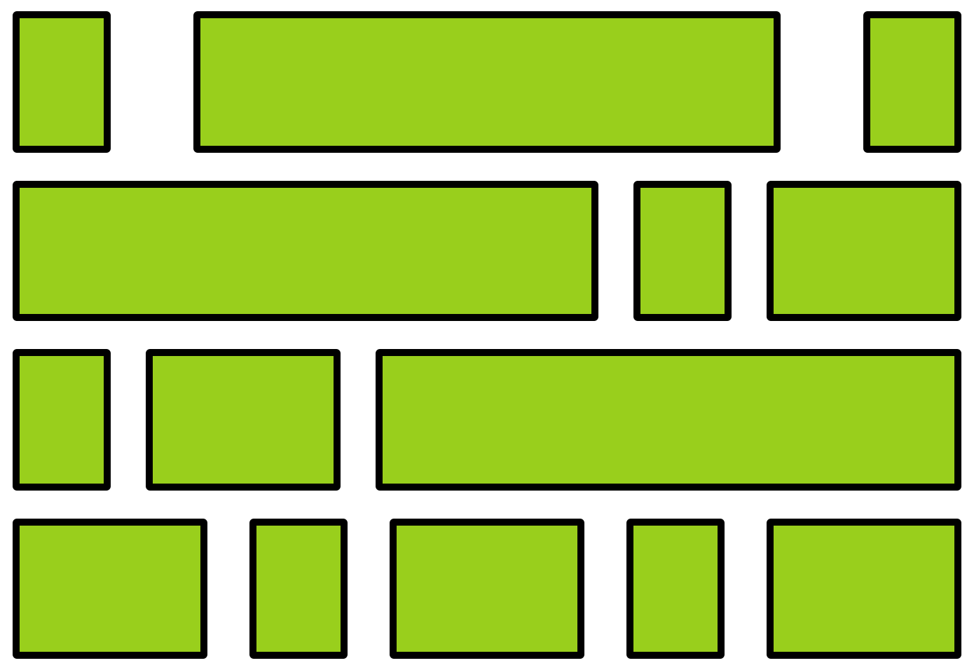
-
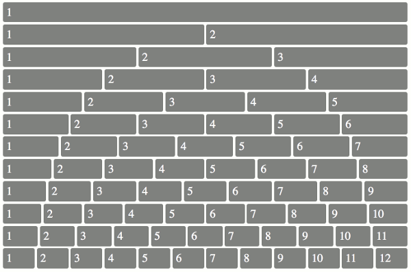
12 column grid 1
Each row is its own flex container, so you can copy and paste any row (or combination of rows) you need from this grid.
Uses a wrapper class for each row. Each element of that wrapper then becomes a flex item. All flex items are distributed evenly across the row.
-
12 column grid 2
Like grid 1, each row on this grid is its own flex container, so you can copy and paste any row (or combination of rows) you need.
Each row contains two flex items (except for the first and last rows, which contain only one). This example uses the
nth-child()selector to select each flex item, but this can be changed to a class.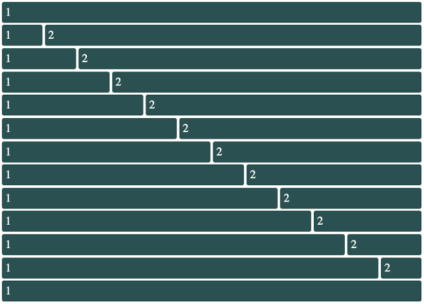
-
12 column vertical grid 1
Flips grid 1 on its side so that the grid items run down the columns. This has an outer flex container which uses the default
flex-direction(row). Each flex item in that row usesflex-direction: columnso to make its flex items run down the column.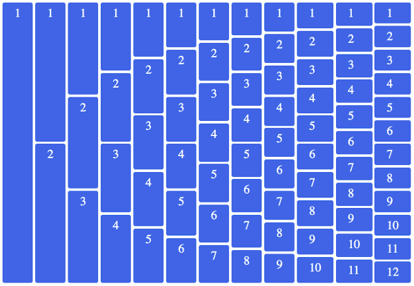
-
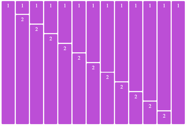
12 column vertical grid 2
Flips grid 2 on its side so that the grid items run down the columns. Same concept as vertical grid 1.
-
